SweetSpot
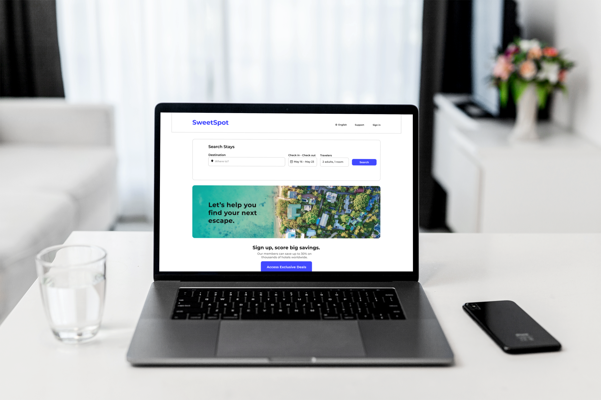
SweetSpot is a hotel booking application that provides users the luxury of ease in finding their ideal hotel. This app is designed to take the complication out of the booking process by providing users with interactive hotel maps and transparent hotel details, enabling them to spend less time navigating and more time relaxing.
Project Overview
Role
UX Designer
Duration
3 months
Tools
Figma, Zoom, Adobe PS, Procreate
Task
Design a new Hotel Booking app
Challenge
Create an original hotel booking application that is responsive to the common pain points users report while booking hotels online, while enhancing the features they are delighted by.
Solution
Conducted user research and analysis to identify key pain points, and from there, designed an interface that enhances usability, information transparency, and visual cues to curate a frictionless experience, streamlining user’s towards their ultimate goal of booking a hotel.
Before designing the app, I needed to know the market. More specifically, I had to understand the user’s goals and the problems to be solved revolving hotel booking applications. So, I began the research process with competitive benchmarking to assess what other booking apps did well, and what other qualities needed improvement. This method allowed me to get a better grasp on existing conventions, and to familiarize myself with how other organizations are trying to solve the same problem.
Research
To conduct competitive benchmarking between different hotel booking applications, I first researched some of the industry’s top competitors. Based on how often the sites were referenced as being the best in their industry, I selected Kayak, Booking.com, Expedia, and Tripadvisor to benchmark. I then reviewed each site for its most notable strengths and weaknesses.
Competitive Benchmarking
Strengths
Clear and organized UI
Booking Calendar shows price per week
Weaknesses
Hotel search filter puts more emphasis on price than user experience/accessibility
Strengths
Defines site's key features upfront
Wide variety of stay-types and luxury pictures showcased
Uses color, shapes, and customization in filter
Weaknesses
Does not provide great details in hotel overview
Map is cluttered — too many features
Strengths
Hotel search filter is named one of the best for accessibility and family-friendly stays
Provides broad selection of hotels
Transparent about hotel details
Weaknesses
Information is not neatly organized; too cluttered of a layout on each page
Strengths
Clean UI Design
Search page displays organized hotel information/key features
Gives great hotel descriptions, seems to center user’s experience the most
Map is concise and also has broad list of options
Weaknesses
Does not provide strong details on hotel search page
To get the most accurate measure of the quality of an interface experience, I recruited five volunteer subjects to participate in a series of usability tests. Rather than creating a survey for the subjects to report their experiences, I wanted to observe them interacting with hotel booking applications first-hand. This would provide a candid report of the goals, behaviors, pain points, and mental models the subjects authentically have towards the experience that they perhaps otherwise would not be aware of enough to report via survey. During each observation, I was able to record each user’s facial expressions, activities, and questions/responses that I could later revisit as needed.
Usability Testing
The feedback I received from conducting this series of usability tests provided deep insight into the real user’s experience — not just my own, highly biased assumption of what the user’s experience might look like. I was able to compile recorded data of each user’s most common complaints and frustrations, helping me to define the problems I needed to solve in this type of product so I could later build effective solutions.
Data is valuable insofar as it is synthesized and used to create a meaningful narrative. During the analysis phase of the UX Design Process, I implemented a series of data analysis methods including affinity diagrams and customer journey mapping in order to understand and empathize with the most prevalent problems faced by users throughout the booking process.
Analysis
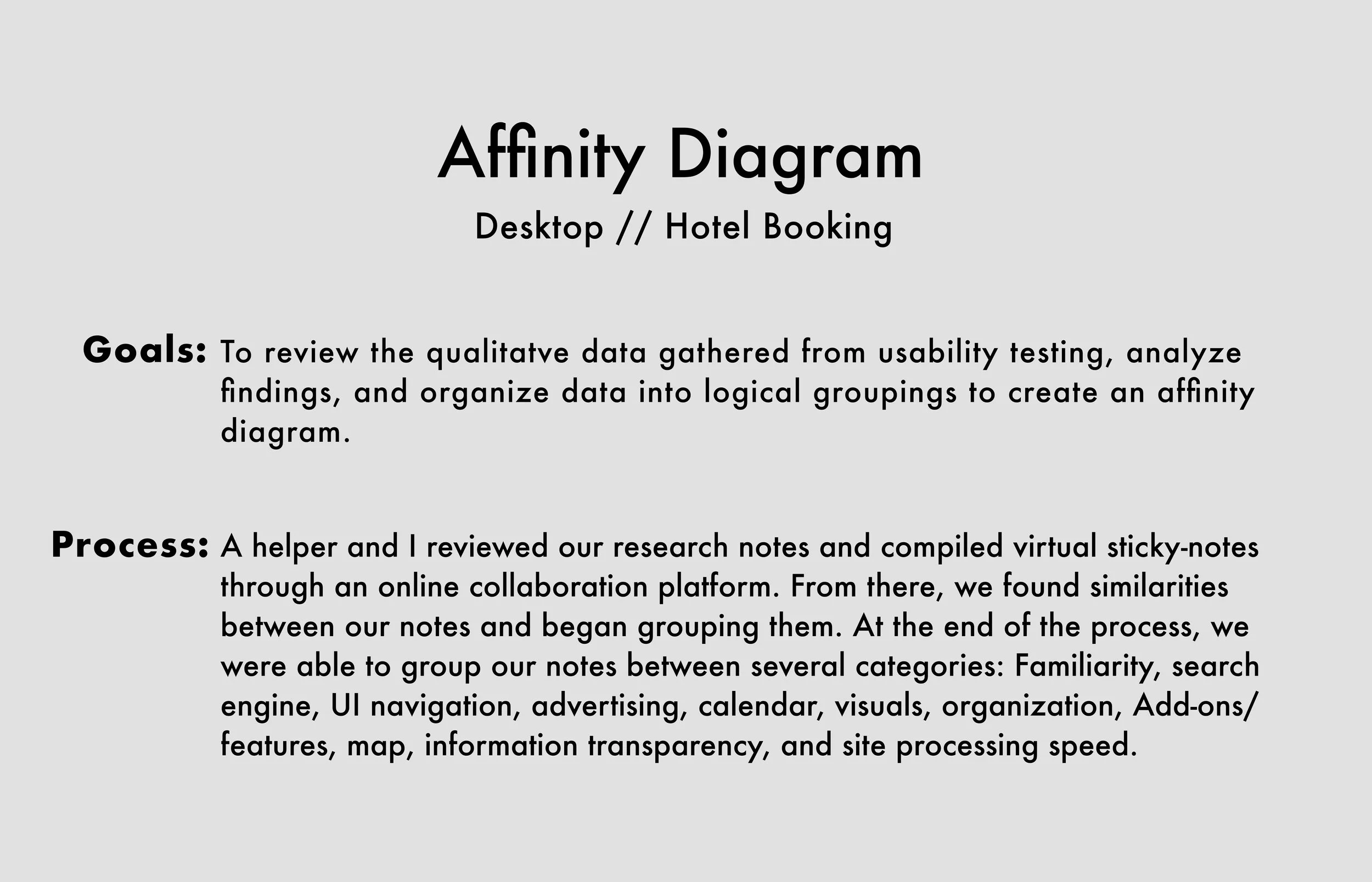
Now that I had compiled enough research data, I was ready to begin organizing it all. A fellow designer and I reviewed our research and compiled virtual sticky-notes through an online collaboration platform. From there, we found common trends among our notes and began sorting them into meaningful categories based on these trends. At the final stage of the process, we were able to group our notes between several categories: Familiarity, Search Engine, Calendar, UI Navigation, Visuals, Organization, Advertising, Add-Ons/Features, Map, Information/Transparency, and Site Processing Speed.
Affinity Diagram
From the affinity diagram, I learned that visual components — including maps, calendars, hotel pictures, and aesthetics — were common topics reported across each user’s experience. Navigation features, such as information organization and transparency, were also prominent trends in our groupings. Going forward, the design of the booking application should streamline information cleanly while providing visual components that allow users to view/interact with the booking process directly.
Using the organized data from the affinity diagram, I was able to create a customer journey map, visualizing what the customer experiences throughout the hotel booking process and understand the parts of the user’s journey that need to be fixed as a priority.
I identified each of the customer’s goals, behaviors, contexts, pain points, and mental models for each phase of booking a hotel online. From there, I then created a best-fit curve with the use of emojis to symbolize whether the overall touchpoint of that phase was a positive, neutral, or negative experience.
Customer Journey Map
Mapping out the customer’s journey proved to be a valuable tool in understanding the problems to be solved. I was able to see a clear and highly structured framework of the strengths and weaknesses presented in the booking process, as well as empathize with the user’s experience in a concrete way. The user pain points reveal that the design needs to adhere to standard booking site conventions, while having a streamlined, user-friendly navigation, information organization, and interactive visual features that make the booking process engaging, helping the user to feel like they are involved as an equal party in their search.
Having collected and analyzed user and market research data, I was ready to embark on the problem solving phase of the UX Design process. Beyond solving problems, I was developing empirically-based solutions. The design objective for this particular case study is to translate this data into a working design that optimizes the information architecture, navigation, and interactivity of the hotel booking interface experience.
Design
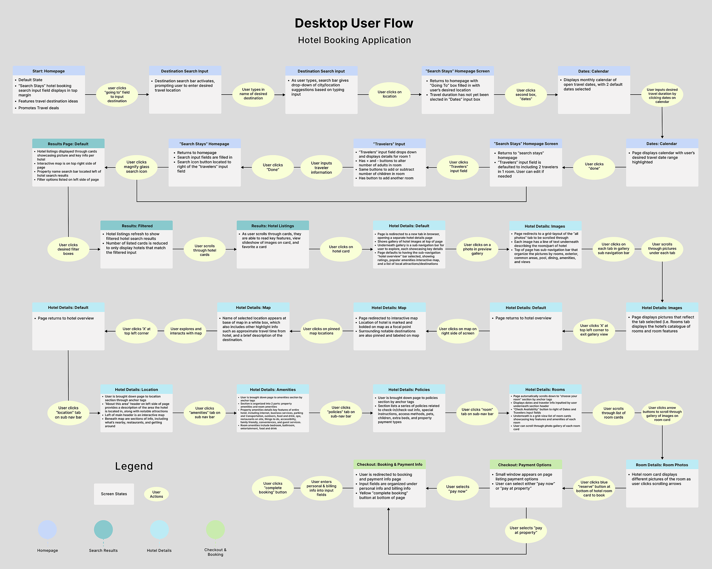
The objective behind the user flow diagram was to map out the booking process design from a high level by applying the conclusions I gathered from the customer journey map. This further allowed me to empathize with the user’s journey, as well as apply a concrete visual roadmap of what exact steps the user must take in order to fulfill their goal of booking a hotel.
User Flow Diagram
Through my understanding of high-level user flow, information architecture, and overall layout of the design, I was able to sketch out low fidelity wireframes to orient the direction of the product, and determine how I could apply the solutions I’d gathered through research and analysis into a working design.
Interaction Design Sketches
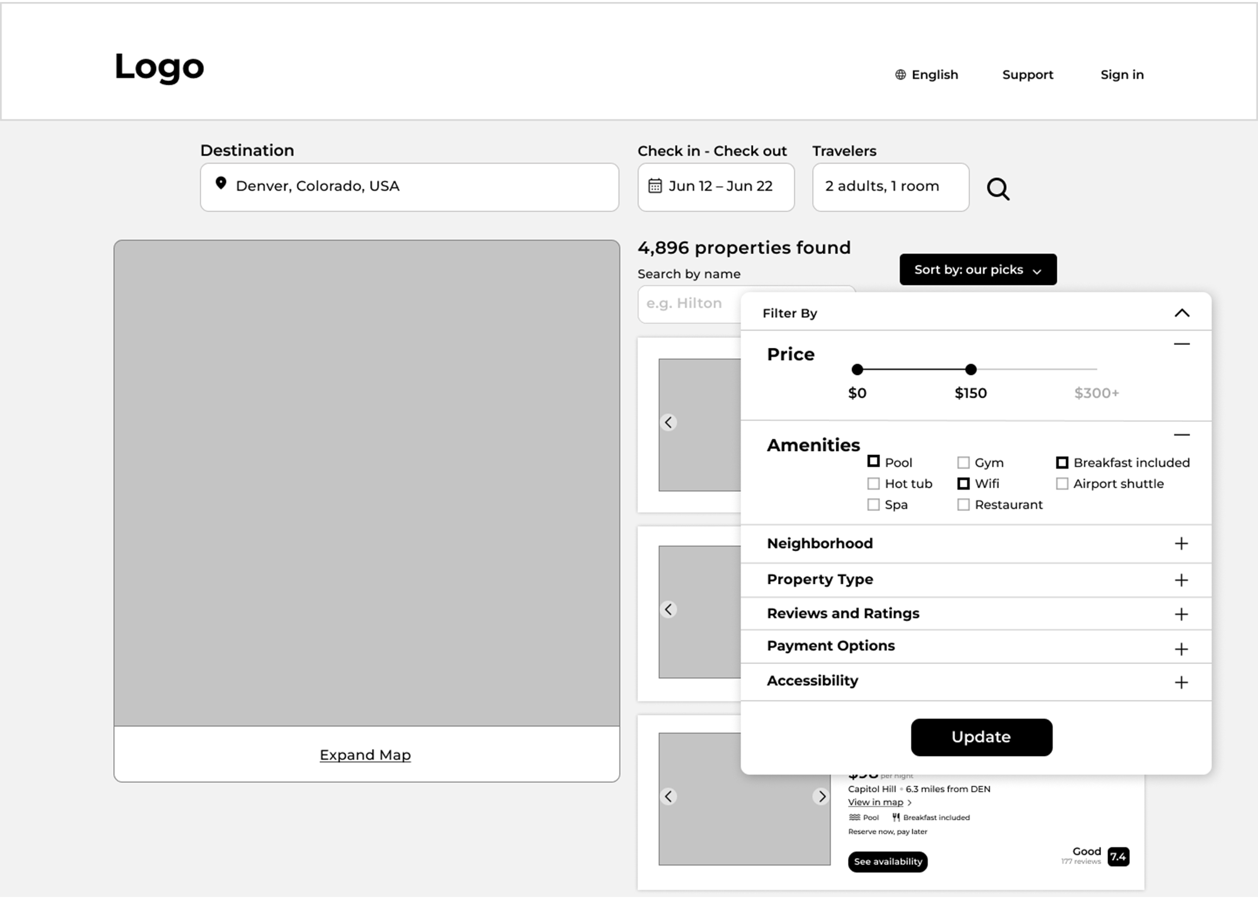
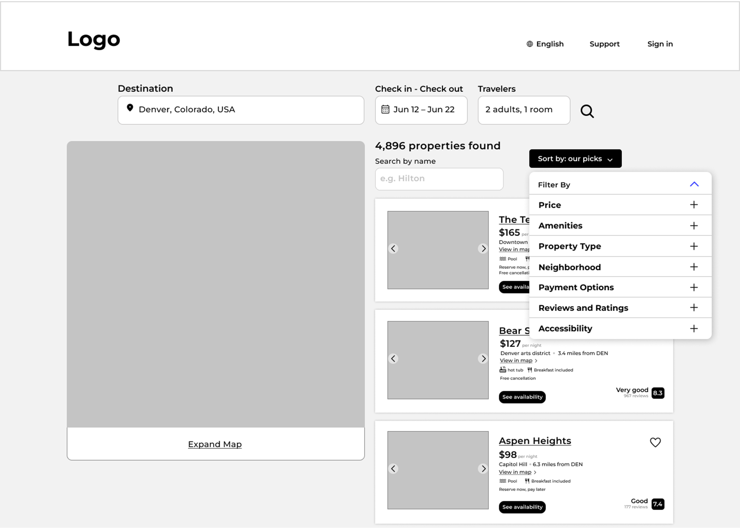
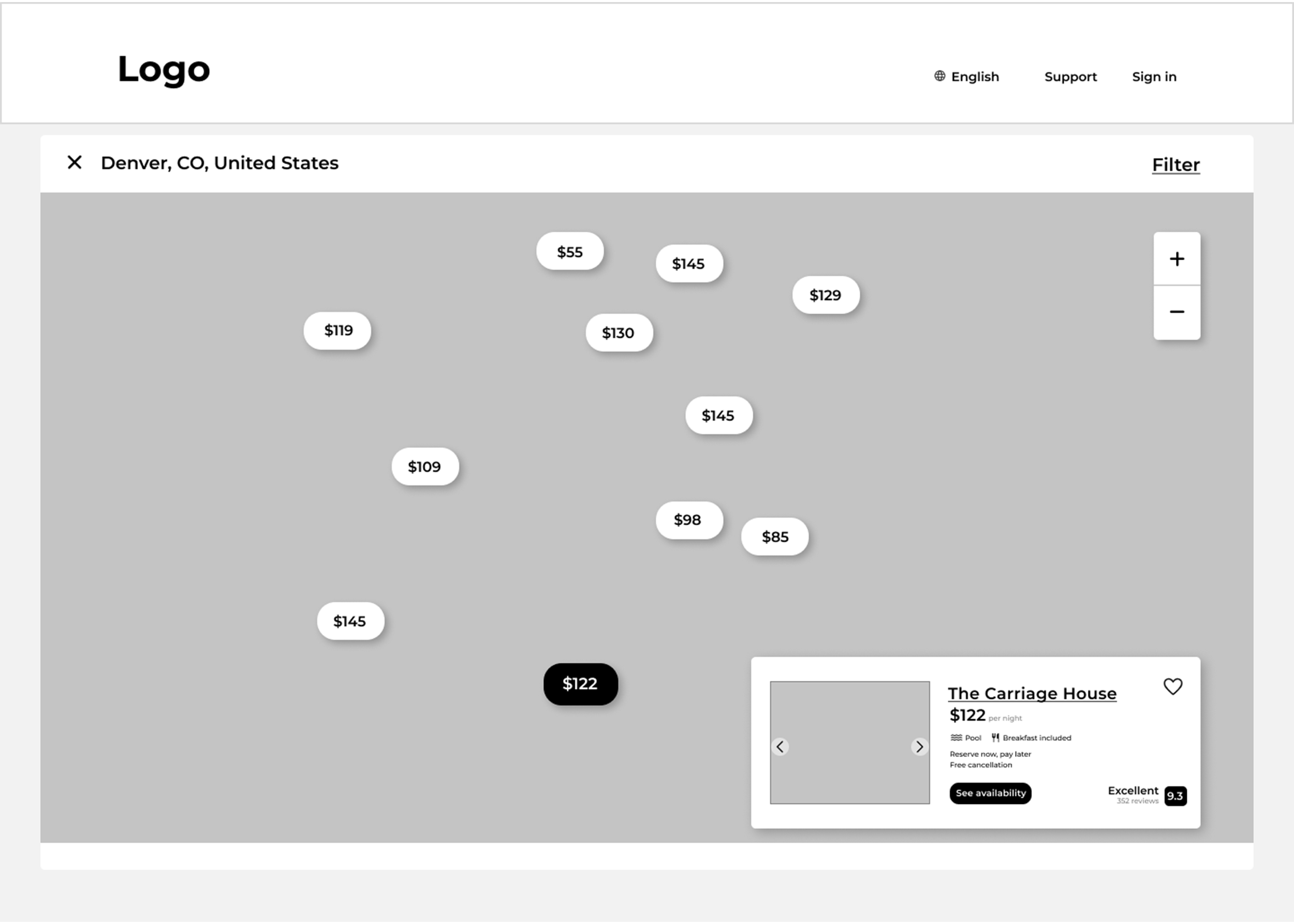
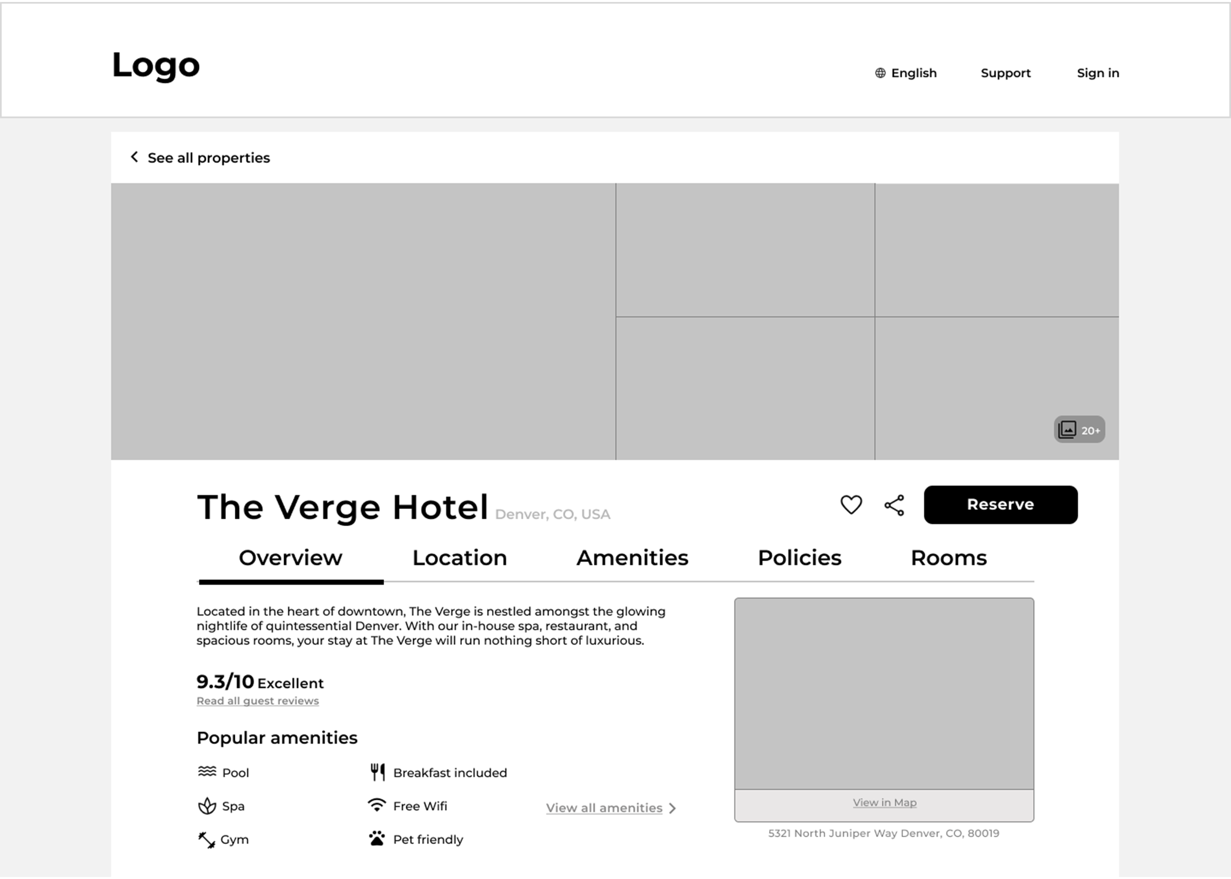
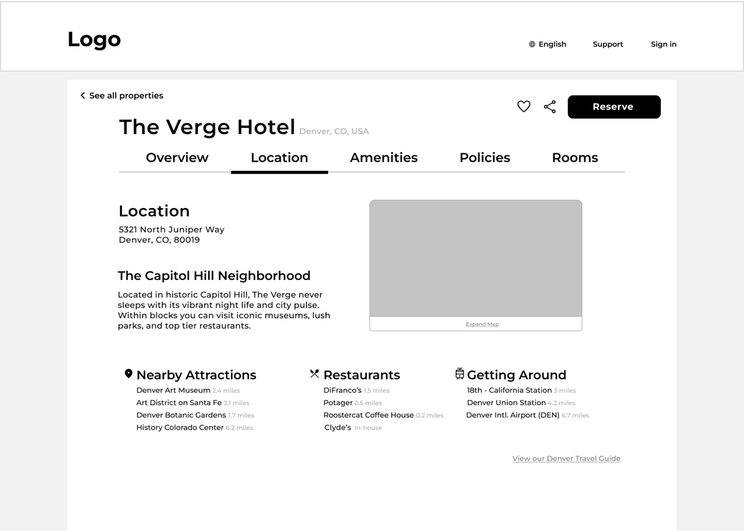
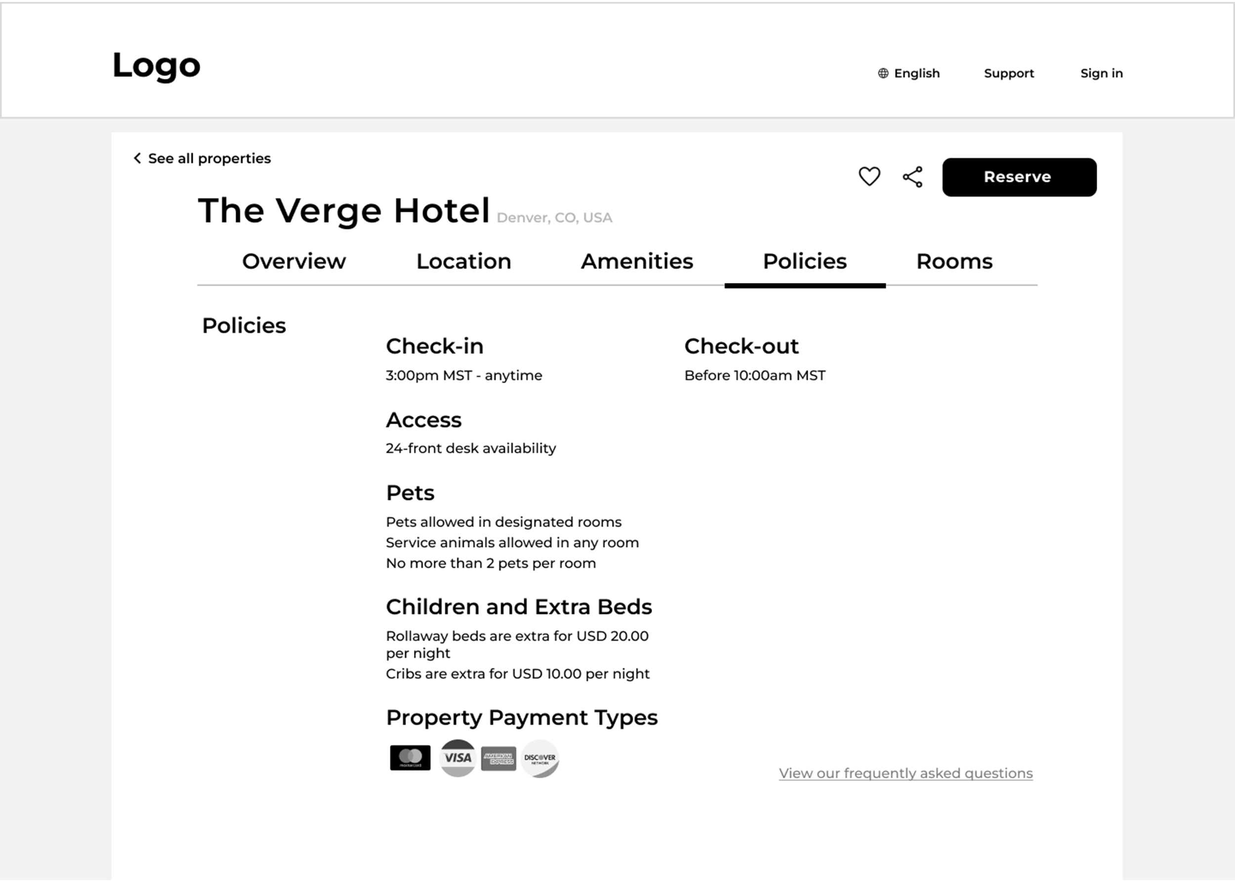
After sketching the general layout/flow of my design, I was ready for my designs to take further shape in the form of medium fidelity wireframes that I created using Figma. This process allowed me to develop and organize the basic structure of the application. The wireframes are image-less and greyscale as I intended to focus my attention on the flow and structure during this process, rather than the branding and UI.
Medium Fidelity Wireframes
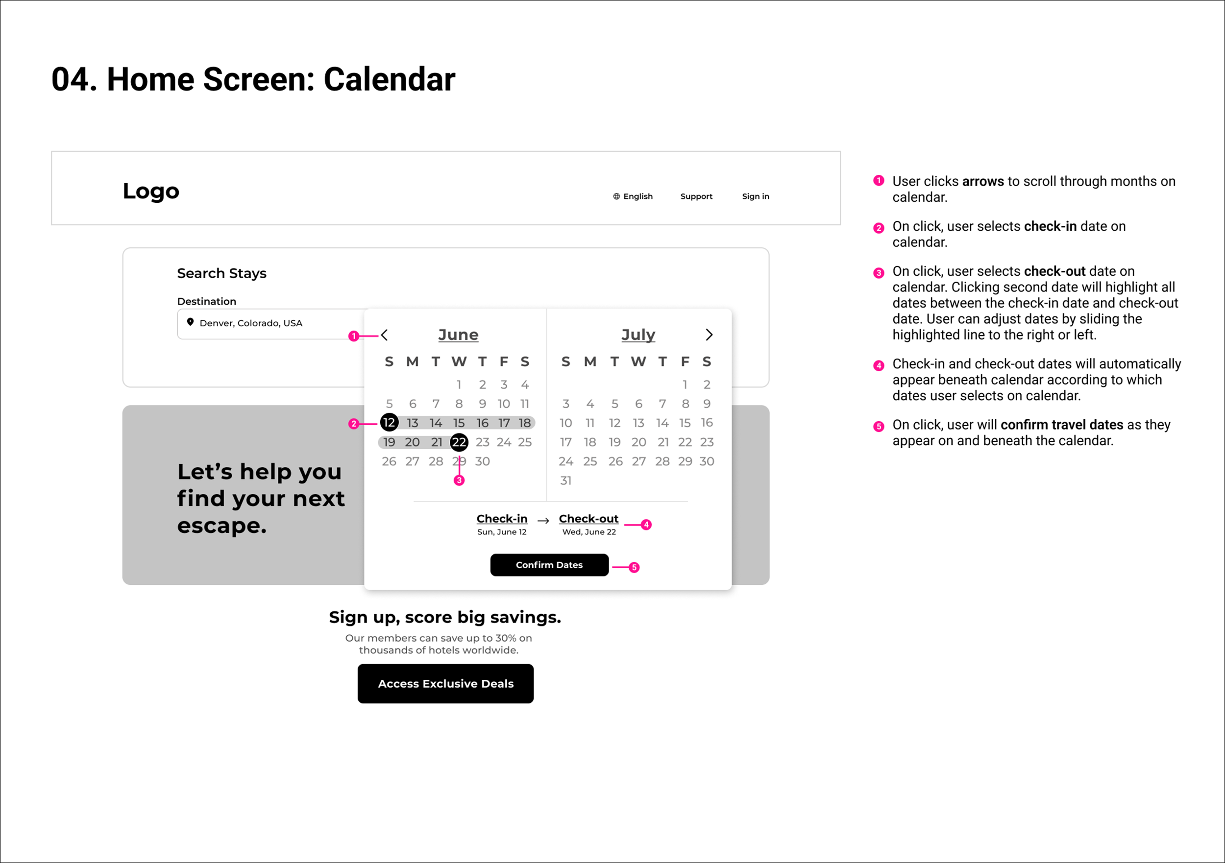
While creating the wireframes, I narrowed my focus on three key areas: visual cues, information transparency, and organization. I strived to provide enough visual features so users wouldn’t need to orient their focus on navigating the site, distracting from the central goal of booking a hotel. These features include the interactive calendar, maps, hotel photo galleries, and accent colors, all designed to intuitively guide users down the right path.
In regards to the information hierarchy, I decided to focus my design on the site’s concision; providing users the right amount of detail, rather than bombarding them with excessive or unnecessary text. With the clean layout of my initial wireframe designs, I intend to create a design that provides users the luxury of ease throughout the booking process.
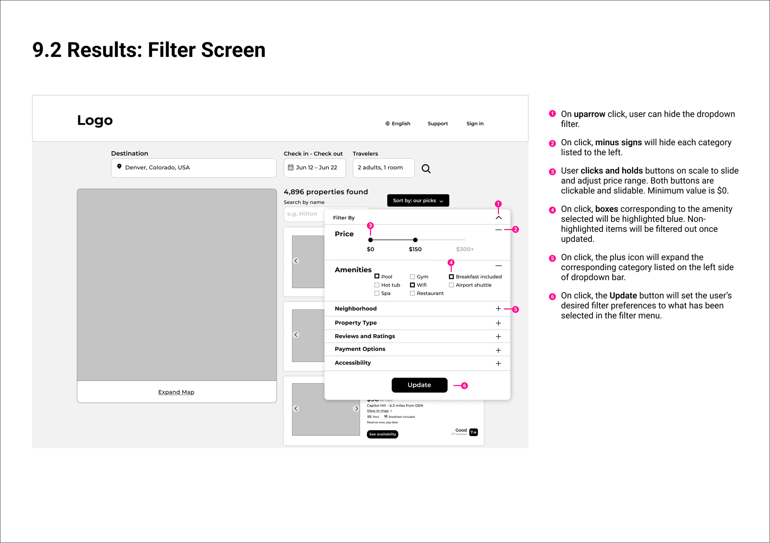
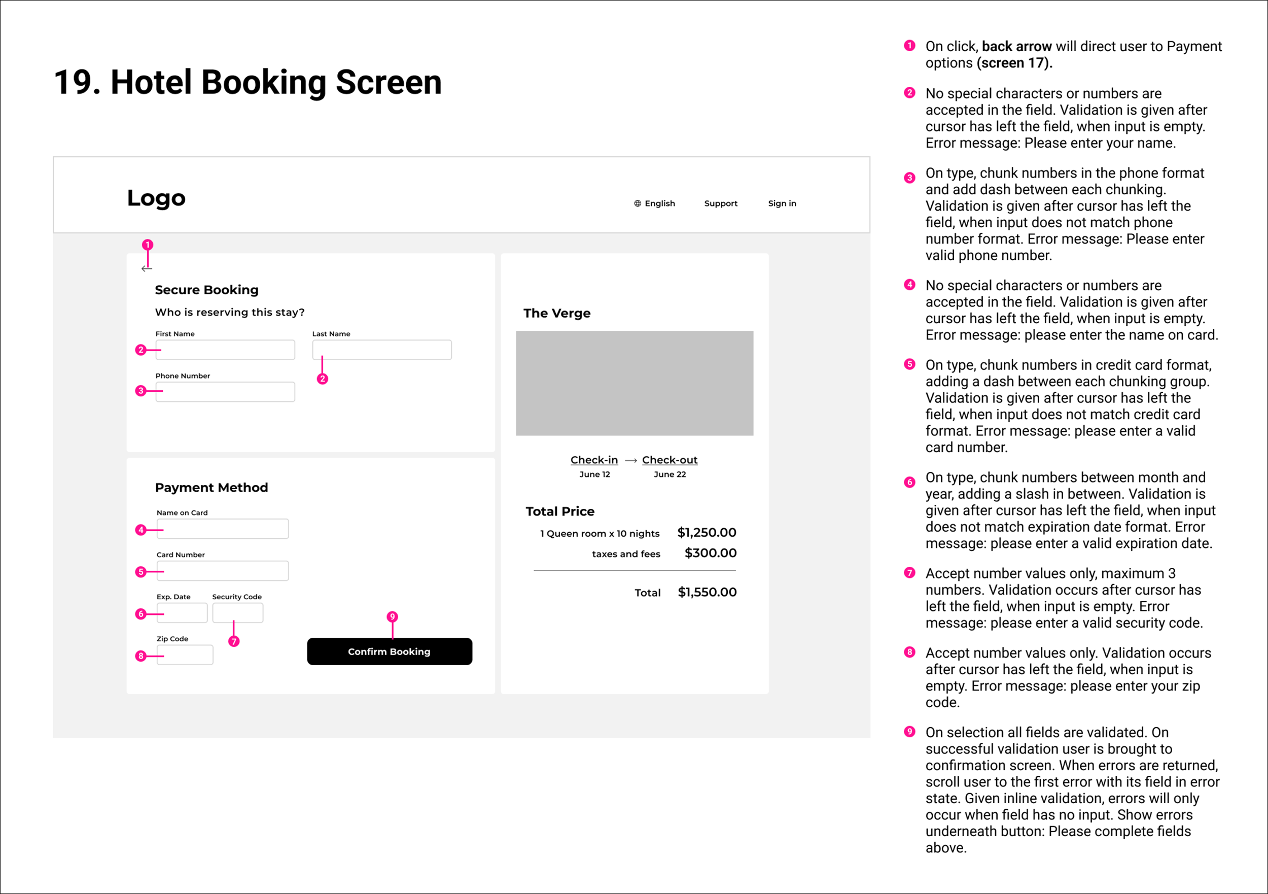
Designing an app’s wireframes doesn’t provide enough information alone; I further have to define the extra details that developers need to build the product accurately. Here, I clarify how the user interacts with the product — the accepted input in fields, action types, CTA’s, etc. Providing all of the necessary information allows the design to be coded and become a fully functional web application.
Developer Handoff
In the final stage of the design process, I created high fidelity mockups of the application’s screens to showcase the polished details of the site, then handed off the notes to developers for the app to be coded. Color, images, and details are included to add to the site’s branding and personality. These examples are versions of how the final product should look once developed.
High Fidelity Mockups
To finalize the project, I reflected on what went well throughout, and which aspects could be improved going forward with other projects in the future.
Reflection
While conducting usability tests, I found it essential to know just the right questions to ask, which is a surprisingly subtle art. It is important to be as objective as possible, while giving just right amount of information for the user to understand their goal. Even during the moments where the user is struggling with knowing where to go or what button to press, it’s imperative that us researchers let them struggle, as painful as that can be. As from these struggles, valuable insights are revealed in regards how to enhance the product.
User Testing
Of course having rich data and analysis as a framework is crucial, but it’s only a portion of the design process. Being a skilled UX designer means applying these conceptual insights into functional interfaces that actually address the problems I am seeking to solve. It can be an overwhelming process, as there truly is an infinite number of possibilities to tackle design challenges (which is of the most thrilling parts of design, in my opinion). But by continually iterating what the problem is, and always keeping the user in-mind, these abstract pain points become translated into products that directly respond to the user’s needs.
From data to Designs
All in all, this entire process was highly insightful, revealing key information surrounding what is valuable to the user experience. One of the key areas that arose from journey mapping and affinity diagrams was the importance of including visual cues that serve to make the booking process more efficient. For example: instead of having to read the location of a hotel in the overview, why not provide a map that users can interact with, and receive more information about the location while doing less work? With travel/booking applications being incredibly widespread, improving the booking experience must exist on a continuum of design iterations without straying too far from conventions. And without having done research, it’s massively difficult to effectively improve a design.
TLDR; Actually doing the research and synthesizing it will reveal more than anything your biased designer perspective could project. It’s worth it, and your users will thank you.
Final Thoughts


