Project Overview
Client
Trimet
Role
UX/UI Designer
Duration
3 Weeks
Tools
Figma, Google Forms, Adobe PS
Goals
Design a public transit app that curates a frictionless and accessible experience for users needing to commute or travel via transit by synthesizing user data, using common pain points to identify the design problem-at hand and convert these insights into a working design.
Design Problems
Portland, Oregon’s current public transit app — Hop — is reported to have serious design and development related problems. These complications include confusing navigation, certain terms or CTA’s are undefined/unclear; app’s bus tracking feature is very limited and takes users to external site, taking longer to load and making it harder to retrieve pass.
Overall, the current design is inefficient, inaccessible, and promotes inequity — all contributing to a poor user experience.
Solution
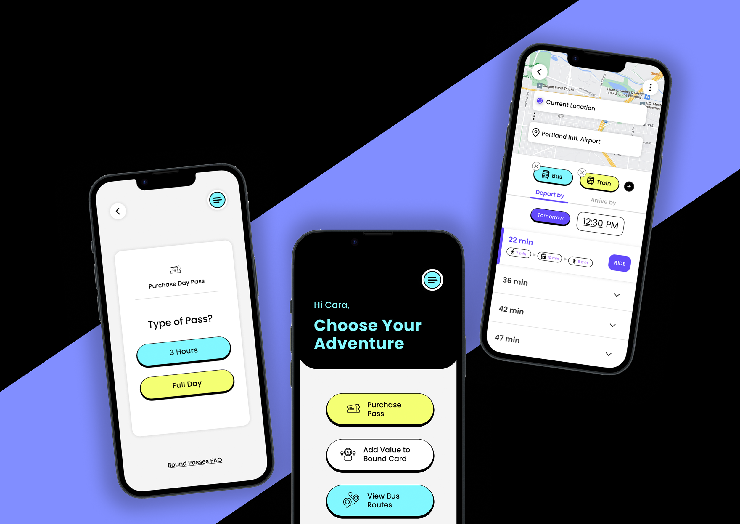
Design a public transit app that responds to the pain points of users, and places their goals at the center. Designed an interface that is simple, intuitive, and focuses on the more common features of the app; allows users to purchase multiple passes and share them with other riders (pass is easily accessible); Bus tracking feature is in-app and allows for users to track buses, find bus stops, route their trip, and updates users on stop closures or delayed routes.
THE CHALLENGE
Restore equity and accessibility in public transit.
The goal for this project was to respond to the widespread complaints of Portland transit commuters who were more than unhappy with the city’s current public transit application. I embraced the challenge of recreating an app that universally appealed to all riders.
The high level goals were to:
Make the app accessible and user friendly for everyone, everywhere.
Streamline the process of buying tickets and passes.
Provide the exact features users are demanding
The typical user fit under one broad category: those using mobile passes to commute throughout the city of Portland. Part of the challenge of this project was that the design had to cater to a diverse group of users, consisting of all ages, proficiencies, devices, etc. There was no single type of user, requiring the app to be universal.
The commuters of Portland, Oregon.
OUR USERS
Add payment methods and to purchase passes through the app, both for themselves and others (i.e. kids, relatives in town)
Use the app to show proof of fare to access transit
Track busses, routes, stops, and receive updates
Ultimately, to get to where they need/desire to be in an efficient manner.
User goals include:
Because I was working as a solo freelance designer throughout the project, it’s important to note that there was a bit of a reach for resources . The project timeline was 3 weeks, not allowing for a great amount of time to conduct more in-depth user interviews/usability testing, thus my ability to interview a robust sample of users was limited. I also could not compensate users (but those with complaints seemed happy enough to volunteer their grievances).
Limits in time, money, and subjects
CONSTRAINTS
I. RESEARCH
To fully understand the goals of my users, I turned to the folks in my community. I selected a random sample of 20 individuals throughout the neighborhoods of Northeast and Southeast Portland, and asked questions related to age, frequency of commuting using the transit app, and general attitudes towards their experiences using the Hop transit app.
User Surveys
30.8% of subjects were 65 & older; 30.8% were between 35-44 years; and 23.1% were between 25-34 years
38.5% of subjects never used the Hop App; 30.8% used the app a few times per year; and 15.4% used the app 3-4 times per week. None of the subjects used the app on a daily basis
62.5% of subjects reported that they were unsatisfied with the Hop app, while 37.5% reported that they were only moderately satisfied
Survey Highlights and Findings:
I. RESEARCH
After conducting survey research and observing the higher rate of unsatisfied users with the current transit app, I wanted to yield a richer understanding of user complaints. I turned directly to the app’s reviews and recorded the most prevalent complaints, then created an affinity diagram by grouping research notes into 3 high level categories.
User Feedback


II. ANALYSIS
User Feedback: Major Complaints
Upon reading user feedback, some major design problems were immediately revealed, and the impact of these problems (in some cases) was pretty severe. I compiled a set of notes, then created an affinity diagram by grouping research notes into 3 high level categories.
Poor organization and Information Hierarchy. Accessing passes is convoluted, users cannot perform simple tasks such as purchasing passes
Unclear CTA’s and features. There are various terms sprinkled throughout the app that users report are unclear and lack context
Inefficient and slow to load. Features in the app are developed inefficiently and require device to open browser (i.e bus route tracking feature)
User Feedback: Major Complaints
II. ANALYSIS
User Persona
To better empathize with Hop’s users, I created a user persona, highlighting the user’s background, goals, and pain points to get a more tangible sense of where to direct design solutions. From here, I knew efficiency and simplicity were key to account for the users main goal of getting to where they need to be, without poor organization getting in the way of that.
“Andrea”
Andrea is a 29 year old administrative assistant who commutes via bus nearly everyday. She has lived in Portland for 8 years, and heavily relies on public transit as her main form of transportation. She enjoys going out with friends and caring for her two cats.
GOALS
Show up to work on time to earn money to support herself
Get from point A to point B safely and efficiently
Get the job done, and enjoy life with friends and family on the side
Attend concerts, games, and social events
FRUSTRATIONS
Has trouble using the Hop app because of loading issues; gave up a while ago and just uses the physical card
When her parents are in town, the headache of using the Hop app is resurged, as they have older phones and limited digital literacy and struggle to navigate it
III. DESIGN
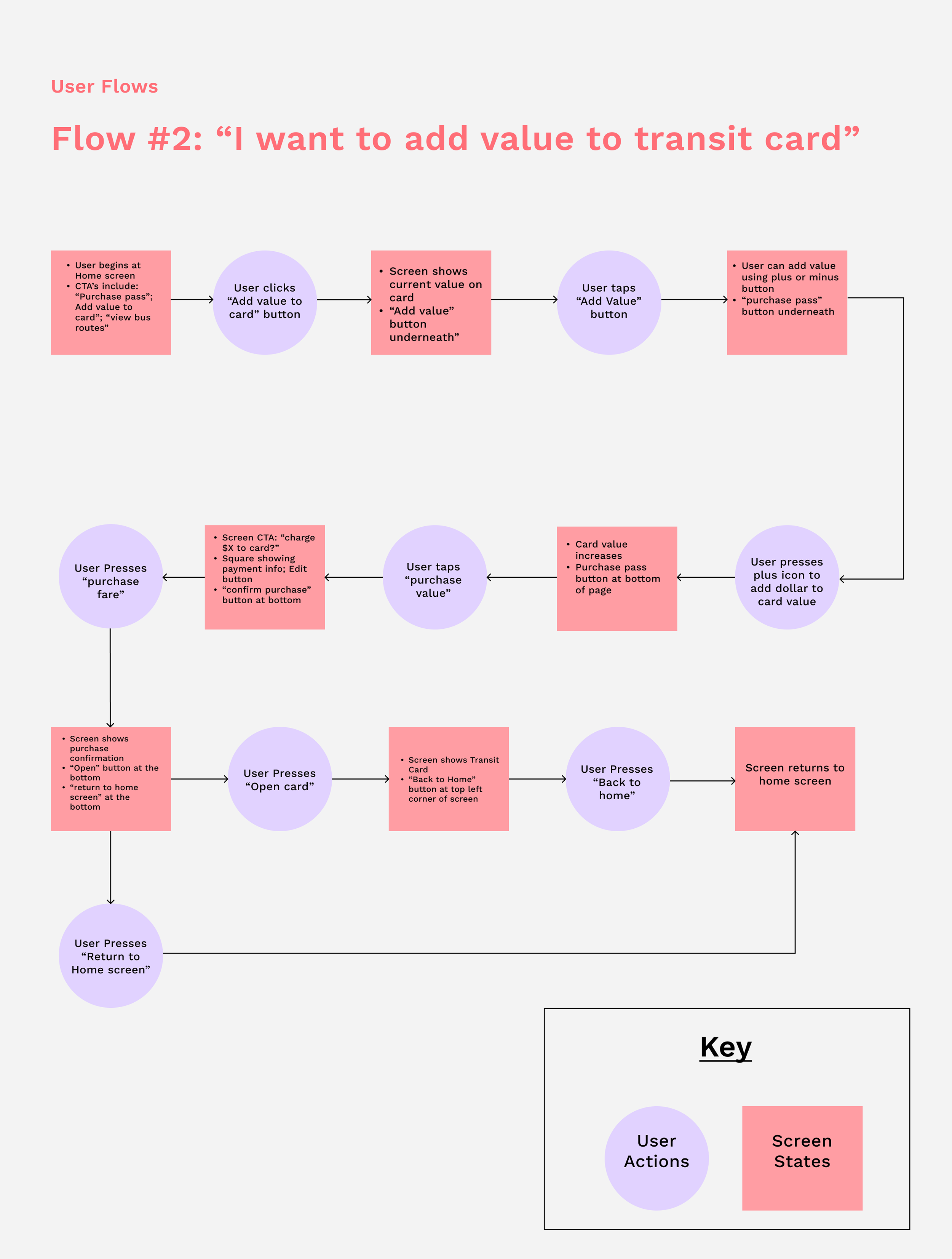
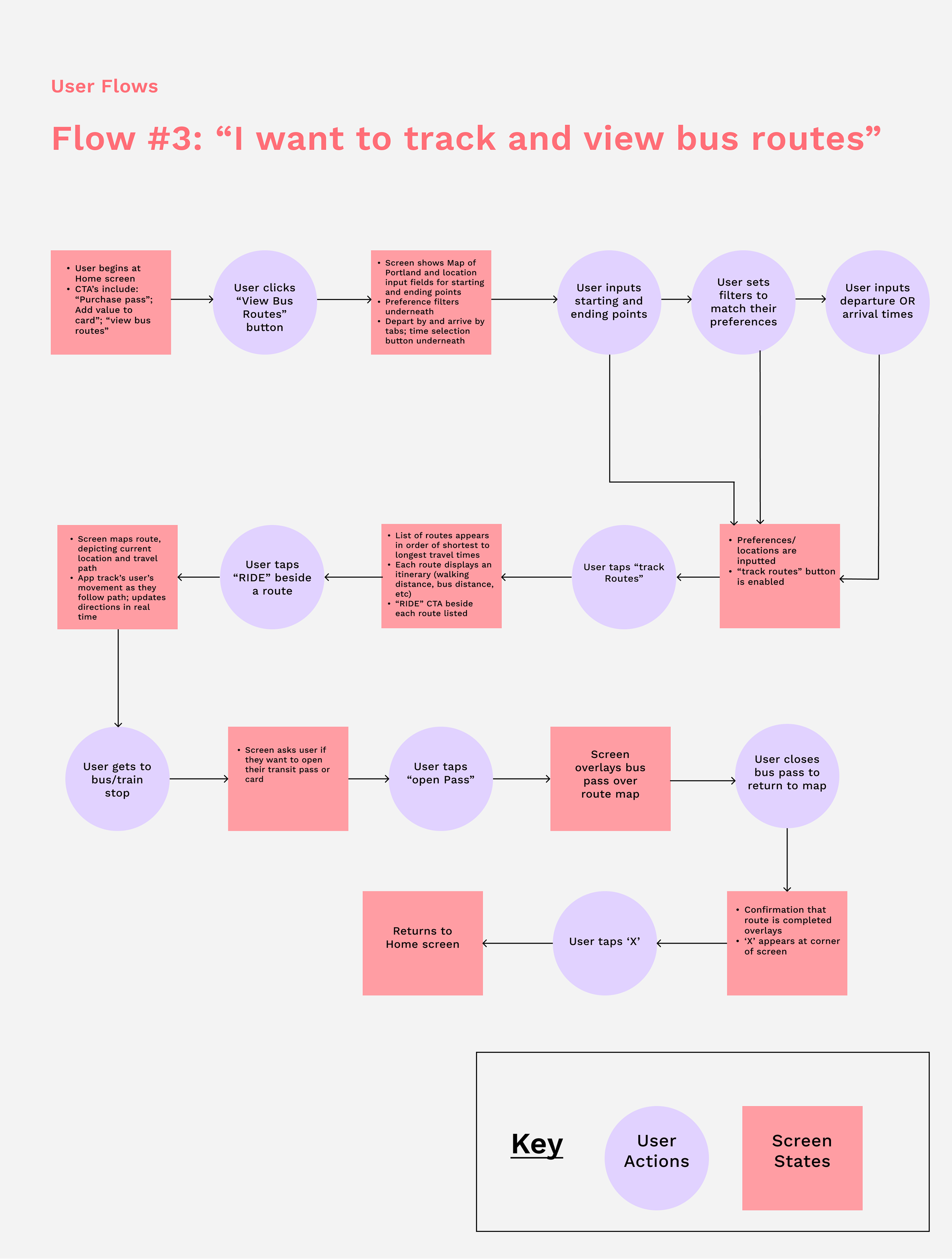
User Flows
Creating user flows allowed me to visualize the process users would take to achieve their goals while using the app. I created 3 flows in total, each one being an ideal flow representing the most straightforward paths users would potentially take.

III. DESIGN
Interaction Design Sketches
Before taking my designs to Figma, I wanted to sketch out possible layouts for each screen to map out where certain features and buttons went. I focused primarily on the screens users would view while purchasing passes and adding value to their transit cards, as these would be the more common flows.

III. DESIGN
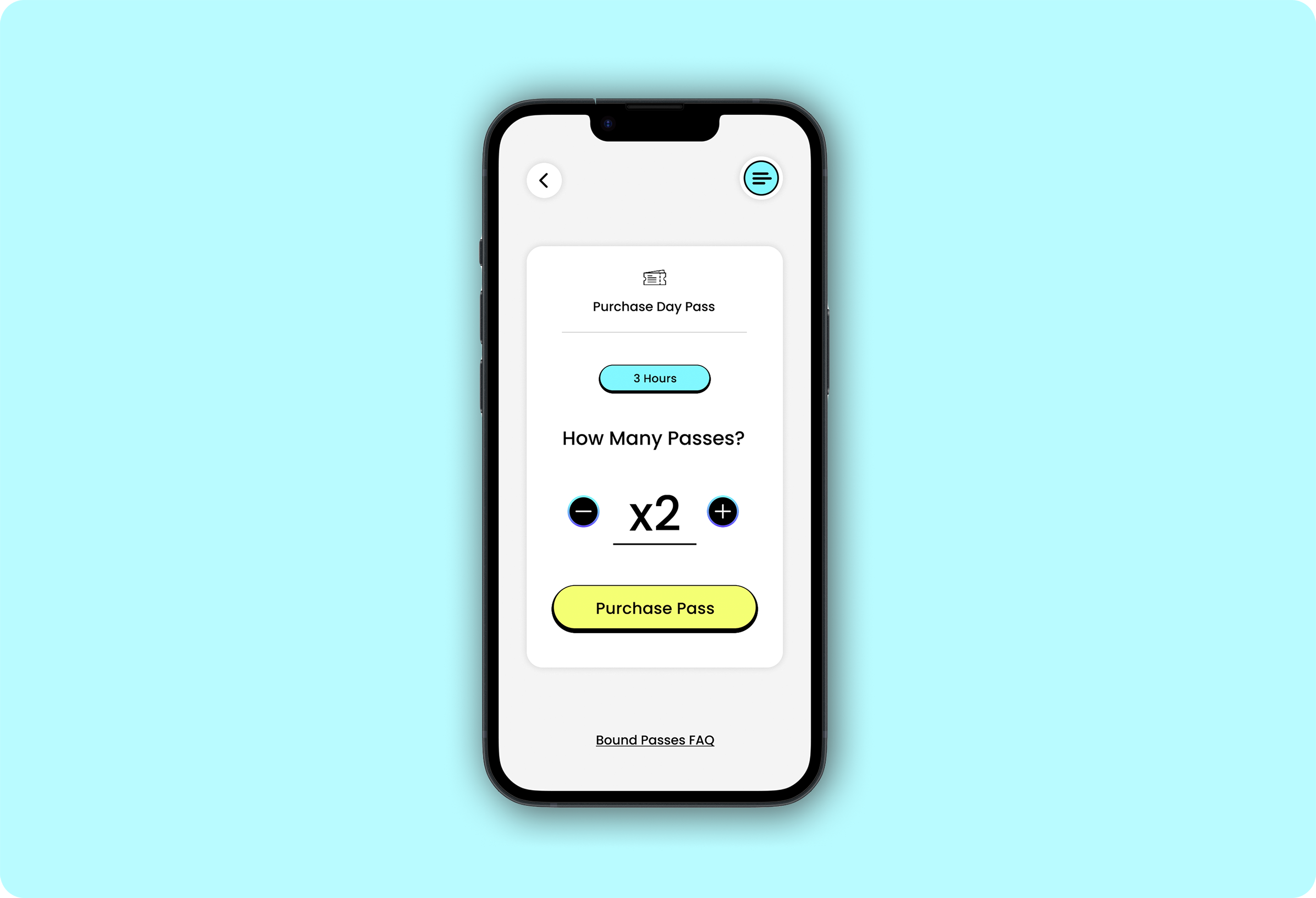
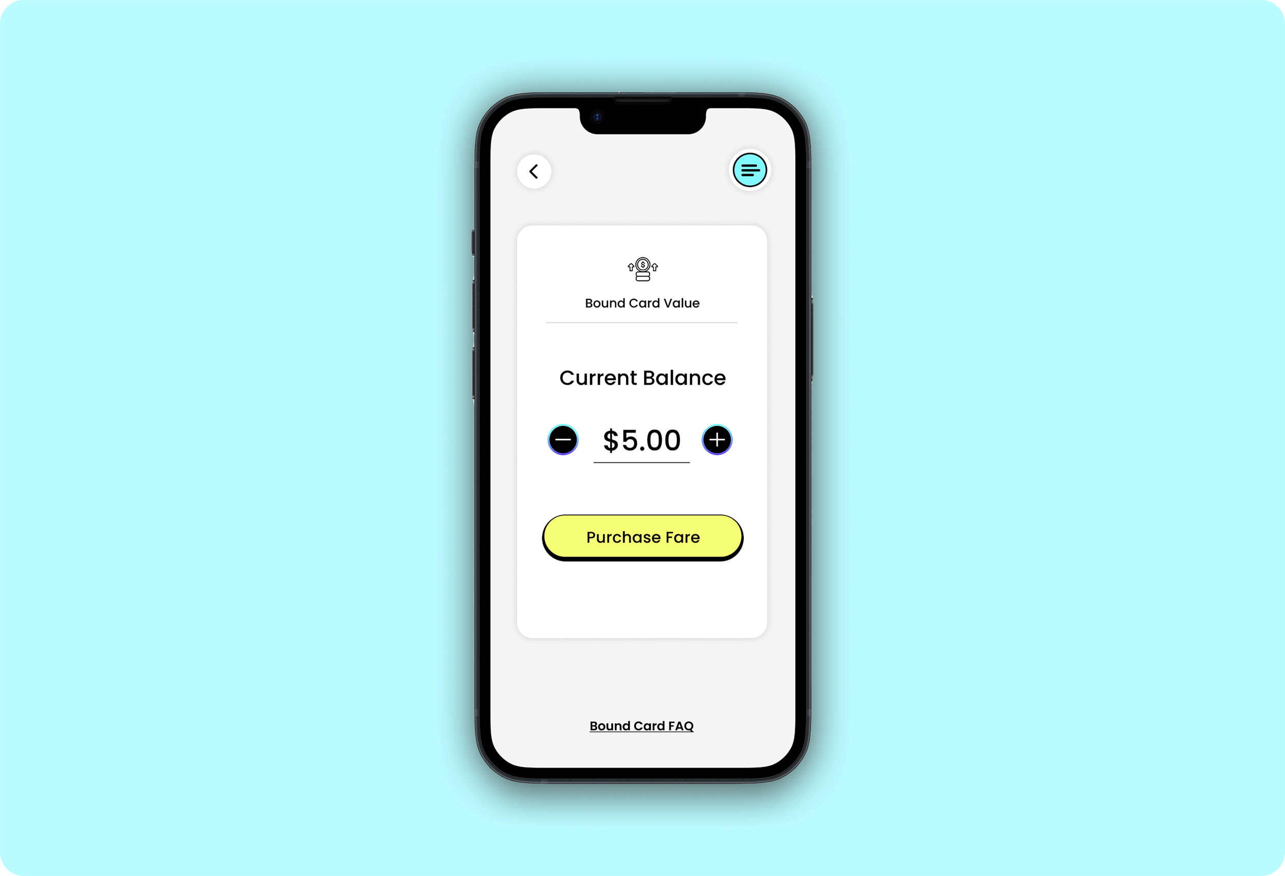
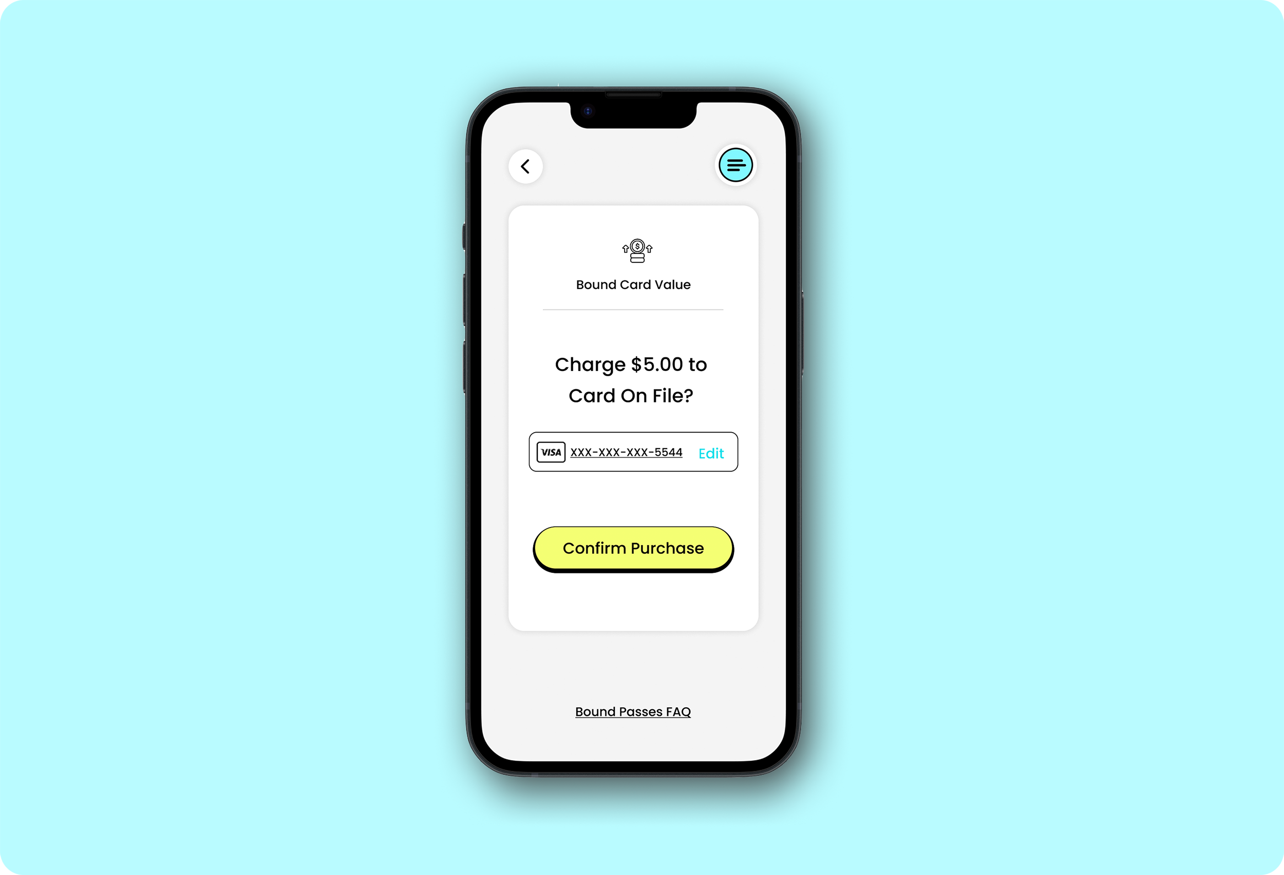
High Fidelity Wireframes & Prototype
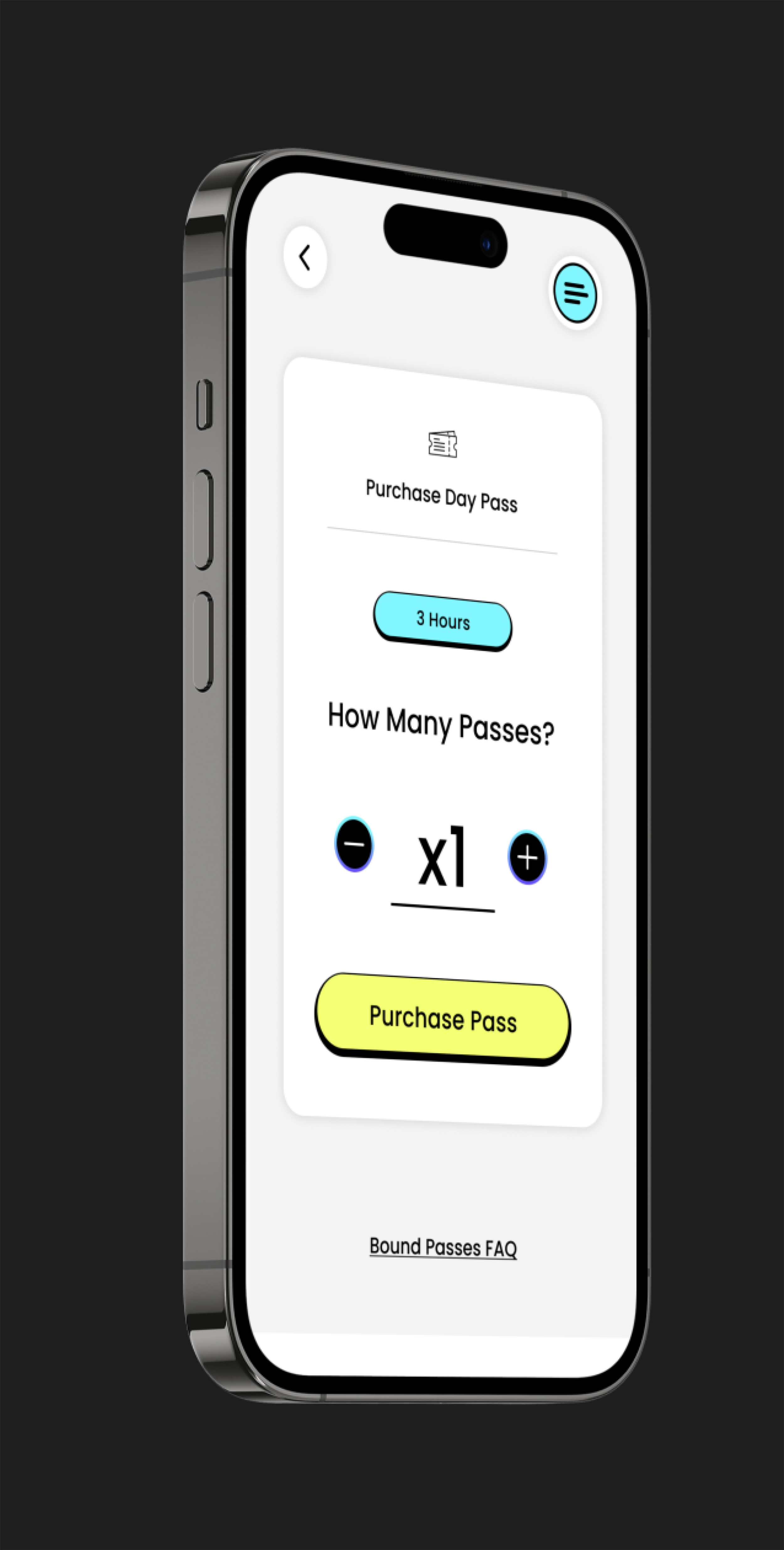
After mapping out the early sketches, I was thrilled to begin creating digital wireframes to represent the final working product. Given my findings from the affinity diagram, I knew to focus these designs on the key areas of organization, clarity, simplicity, and efficiency.
The ultimate goal for the product was to directly streamline users towards achieving their desired tasks by placing the most common flows at the forefront, while allowing simple access to the rest of the app. I focused on fine-tuning the details as well, including button transitions and confirmation animations to both create an engaging experience, while also providing users with feedback as they interacted with each button & screen.


IV. REFLECTION
Outcomes & Reflection
Ultimately, the final design significantly increased usability based on usability tests I conducted after the design phase. Users were able to accomplish their tasks at a 95% rate, replicating the success users would have with the app when using it organically.
All in all, I learned the significance of integrating needs of users into a working design, especially considering that this specific design would be used by a vast type of user. It was therefore essential that it be simple and intuitive. I found it necessary also to cater the app’s design towards the most common flows, as the nature of a transit app is to primarily do one thing: allow users to board their mode of transportation.
I’d like to thank all who contributed to this project; I could not have completed this without the feedback and insights provided by my subjects and peers, as this piece is ultimately what gives the design its backbone.


