Knowt Website Redesign
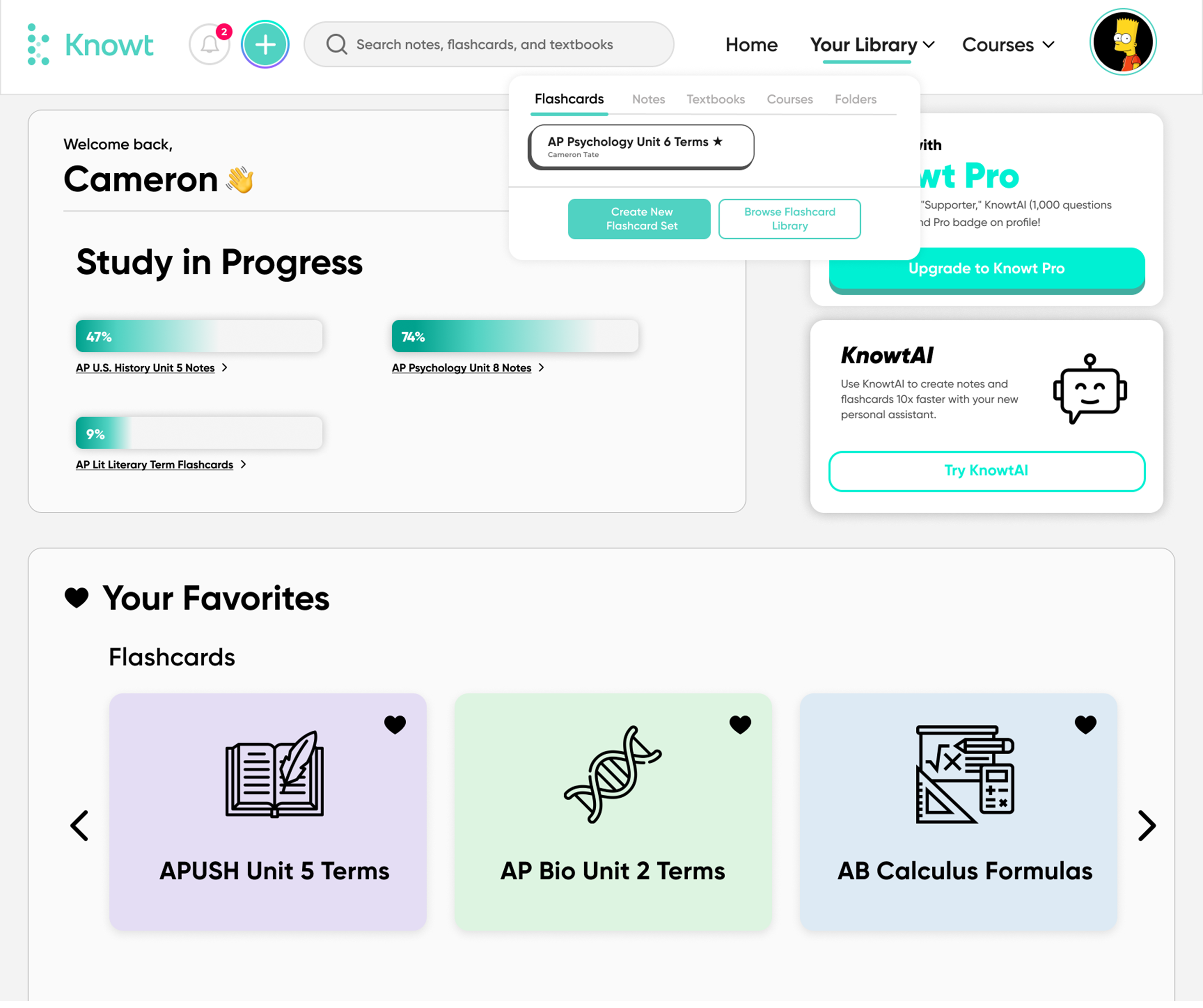
Knowt is an eLearning website where users can access a vast library of study sets, or create their own with the help of an AI assistant. To enhance the usability of the website, I audited its features and layout for areas of improvement, then created designs that respond to the needs of users so they can efficiently access Knowt’s database of study material.
Knowt Website Redesign
Client
Knowt
Role
UX/UI Desinger
Duration
1 week
Tools
Figma, Adobe PS
Challenge
Audit Knowt’s website — an eLearning SaaS platform that integrates AI — for usability and user-friendly navigation, and design screens that enhance the overall user experience. The original design of Knowt’s website was not very user-friendly, lacked clear information hierarchy, and needed a more personalized approach to its eLearning product.
Solution
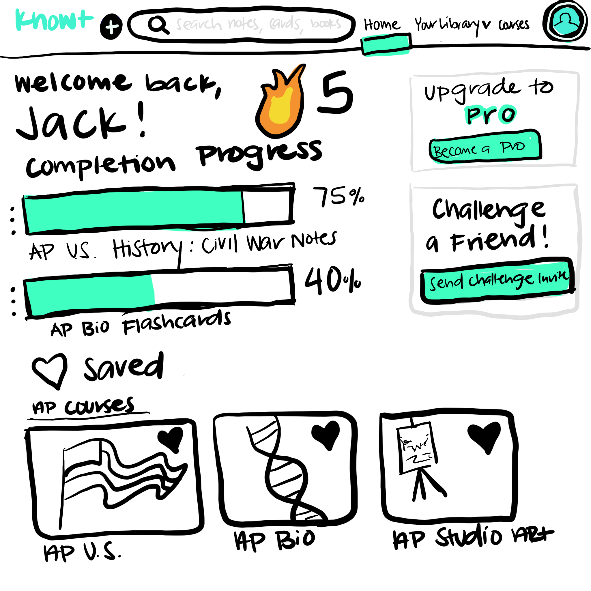
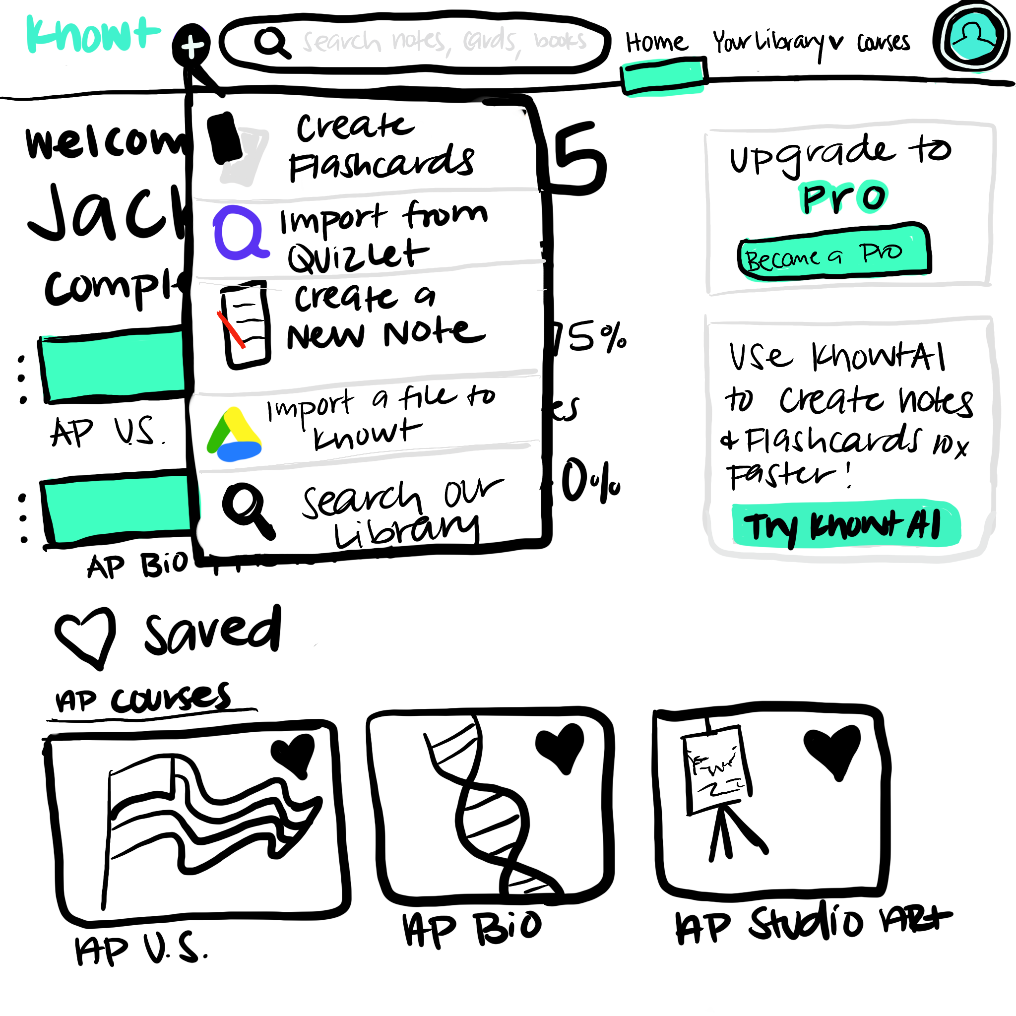
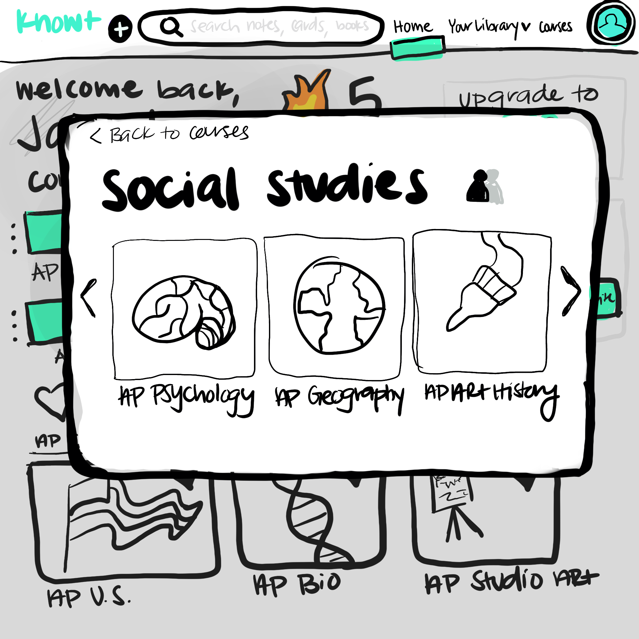
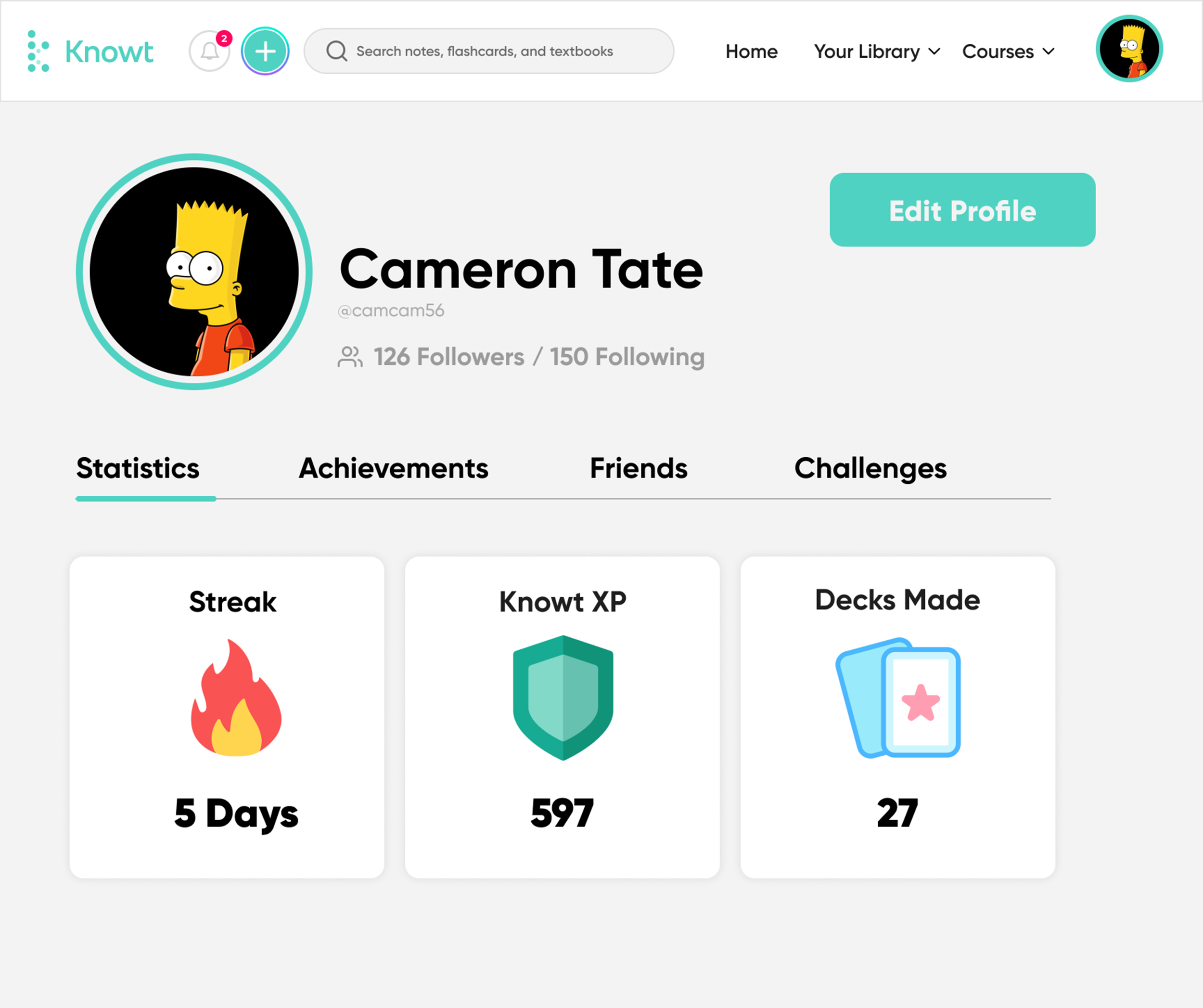
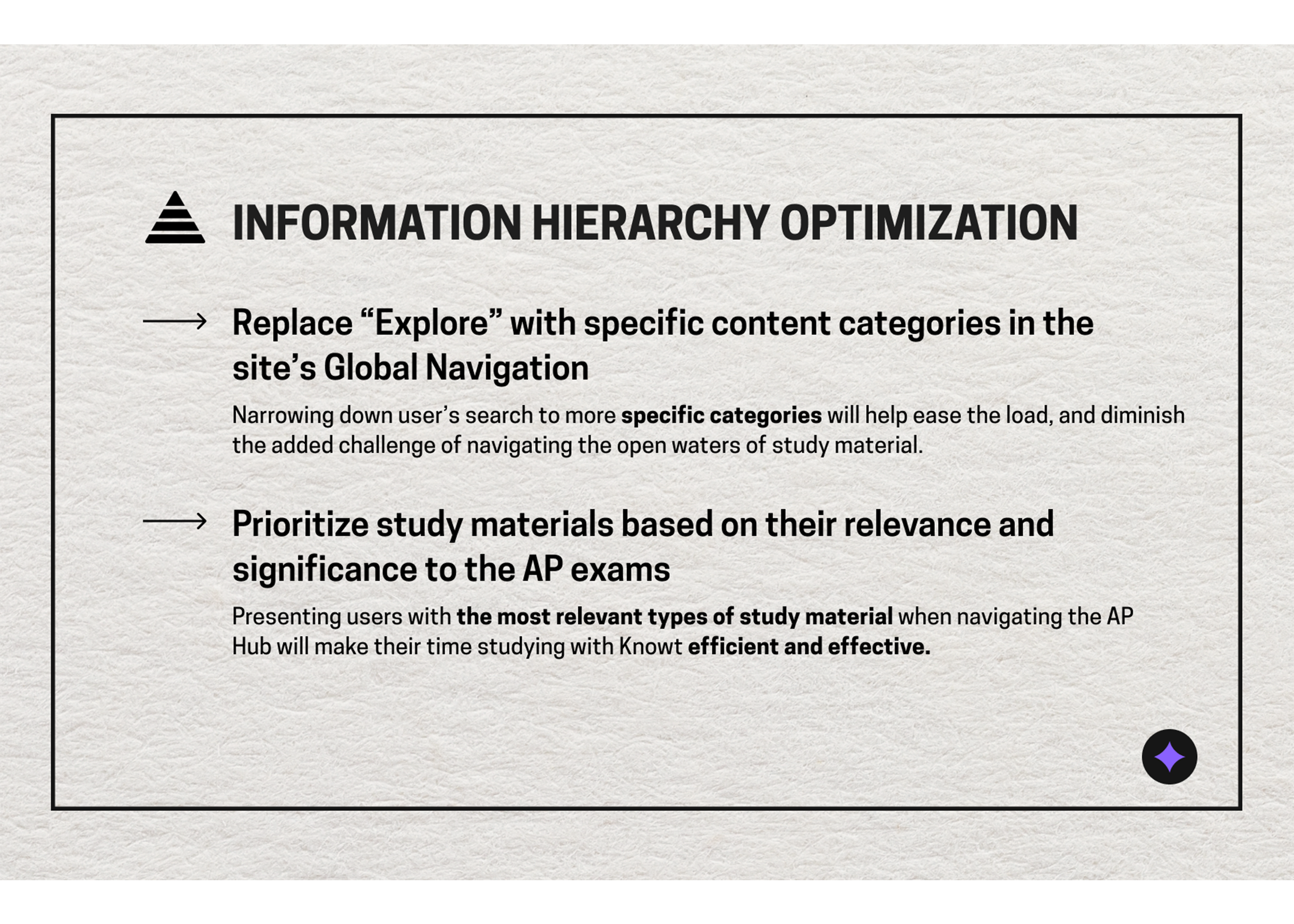
Designed screens that are personalized through progress reports and stats; provided user-friendly navigation through clear visual cues; and added information hierarchy by defining specific learning categories and including them in the Global Navigation.
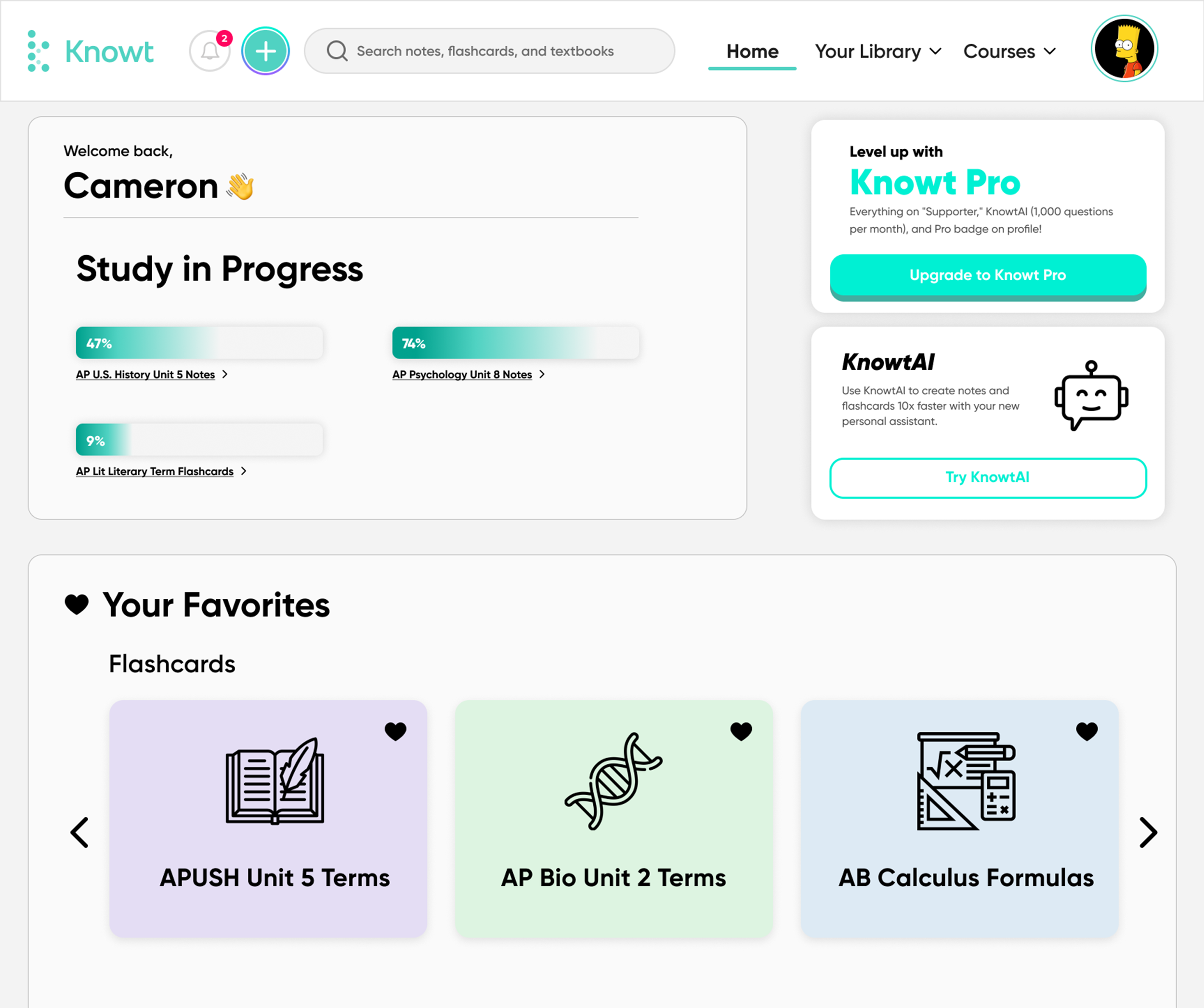
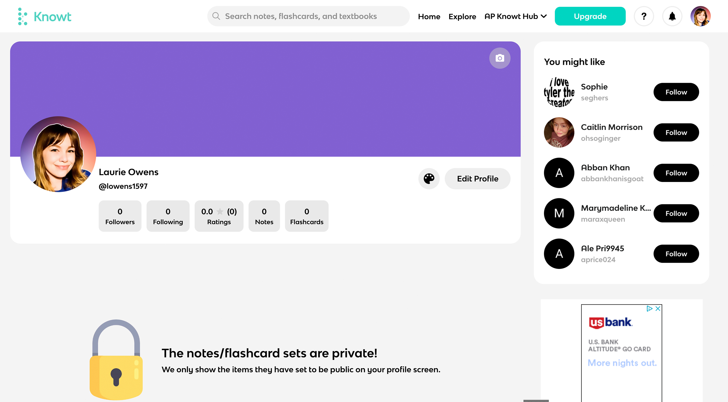
Knowt’s Original Website Design
Already very information heavy off-the-bat, the landing page is busy and lightly convoluted. The primary navigation is unclear and overambitious, and important CTA’s are not clearly placed. Additionally, users really have to seek out what they're looking for, as the content is not intuitively designed. Rather than organizing information by specific categories so that users can digest small pieces of info at a time, the information hierarchy is very loose.
Overall, the UI and organization of the site is not user-friendly, establishing a sense of distrust in users toward the site, and diminishing Knowt’s brand authority.
Website Audit
To better empathize with Knowt’s users and understand their context and background, I created a user persona, highlighting the user’s interests, goals, expectations, and pain points to get a more tangible sense of where to direct my website evaluation. From here, I knew efficiency was key to account for a student’s perhaps busy schedule, so prioritizing navigation and information hierarchy would be essential (this will be expanded on in the design rationale).
Knowt User Persona: “High School Student Sam”


